FinMate
Brand Identity / Product Concept / Fintech
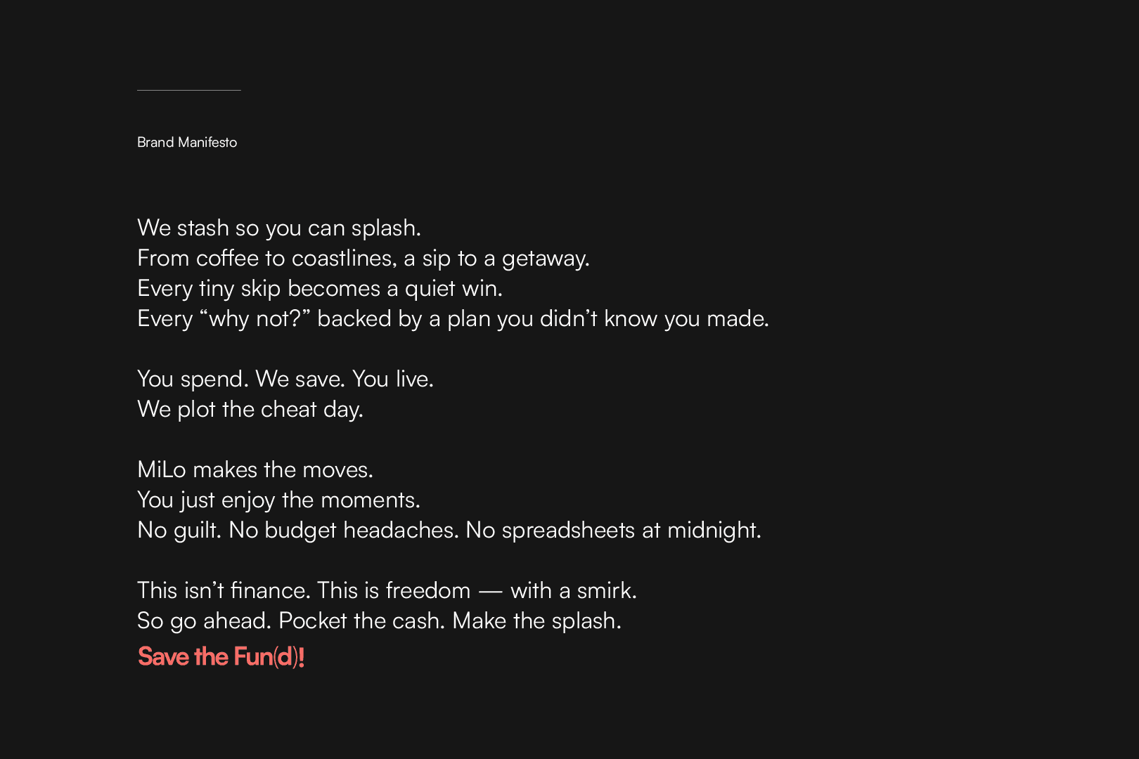
Saving Money Without the Stress Language
A brand and product concept for FinMate, a savings app designed to make money management feel lighter, smarter, and more emotionally intuitive. The work brought together identity, tone of voice, brand expression, and UI direction to shape a fintech experience that feels warm, clear, and quietly motivating. The core insight in the deck is that people save more effectively when the process feels automatic and emotionally rewarding, not effortful or guilt-driven.

Overview
A fintech concept built to make saving feel less like discipline and more like momentum.
A fintech concept built to make saving feel less like discipline and more like momentum.
A fintech concept built to make saving feel less like discipline and more like momentum.
Industry - Fintech / Consumer App / Personal Finance
Industry - Fintech / Consumer App / Personal Finance
Role - Brand Identity, Product Concept and UI Direction
Role - Brand Identity, Product Concept and UI Direction
Scope - Naming, Identity, Tone of Voice, Brand Expression, UI Direction and Product Flow
Scope - Naming, Identity, Tone of Voice, Brand Expression, UI Direction and Product Flow
Timeline - 2025 (Concept Project)
Timeline - 2025 (Concept Project)
The Idea
Money Shouldn’t Feel Like Math Homework
Money Shouldn’t Feel Like Math Homework
Money Shouldn’t Feel Like Math Homework
We save for feelings, not numbers.
We save for feelings, not numbers.
We save for feelings, not numbers.
FinMate begins with a clear behavioural insight: people save more effectively when the process feels automatic and emotionally rewarding rather than effortful or guilt-driven. From that came a warmer and more human fintech concept, one that frames saving not as restriction but as quiet progress toward something you actually want. The language, brand behaviour, and product direction all build from that shift.
FinMate begins with a clear behavioural insight: people save more effectively when the process feels automatic and emotionally rewarding rather than effortful or guilt-driven. From that came a warmer and more human fintech concept, one that frames saving not as restriction but as quiet progress toward something you actually want. The language, brand behaviour, and product direction all build from that shift.
FinMate begins with a clear behavioural insight: people save more effectively when the process feels automatic and emotionally rewarding rather than effortful or guilt-driven. From that came a warmer and more human fintech concept, one that frames saving not as restriction but as quiet progress toward something you actually want. The language, brand behaviour, and product direction all build from that shift.

The Brand
Identity
Identity
Identity
The identity was built to feel clear, friendly, and forward-moving. The symbol combines a FinMate “F” with cues taken from a forward arrow, a growth spine, and a progress graph, giving the brand a mark that feels simple but purposeful.
The identity was built to feel clear, friendly, and forward-moving. The symbol combines a FinMate “F” with cues taken from a forward arrow, a growth spine, and a progress graph, giving the brand a mark that feels simple but purposeful.
The identity was built to feel clear, friendly, and forward-moving. The symbol combines a FinMate “F” with cues taken from a forward arrow, a growth spine, and a progress graph, giving the brand a mark that feels simple but purposeful.


Expression
The brand extends into a brighter and more playful visual world through colour, icon behaviour, badges, pattern, and social expression. It keeps the fintech category from feeling cold, while still staying controlled and digitally clear. Pages 7 to 9 are especially useful here.
The brand extends into a brighter and more playful visual world through colour, icon behaviour, badges, pattern, and social expression. It keeps the fintech category from feeling cold, while still staying controlled and digitally clear. Pages 7 to 9 are especially useful here.
The brand extends into a brighter and more playful visual world through colour, icon behaviour, badges, pattern, and social expression. It keeps the fintech category from feeling cold, while still staying controlled and digitally clear. Pages 7 to 9 are especially useful here.


The Product
MiLo
MiLo
The concept introduces MiLo as the app’s calm, calculating, casually brilliant savings companion. This gives the product a more human interface and helps the experience feel like guidance rather than pressure. The persona language is one of the stronger differentiators in the project.
The concept introduces MiLo as the app’s calm, calculating, casually brilliant savings companion. This gives the product a more human interface and helps the experience feel like guidance rather than pressure. The persona language is one of the stronger differentiators in the project.
The concept introduces MiLo as the app’s calm, calculating, casually brilliant savings companion. This gives the product a more human interface and helps the experience feel like guidance rather than pressure. The persona language is one of the stronger differentiators in the project.

Product Experience
The UI direction carries the same tone into the product itself, using bold contrast, simple navigation, and reward-led interactions to make saving feel active but not stressful. The screen flows show a product designed around goals, cards, chat, transactions, and light gamified moments like cashback spins.
The UI direction carries the same tone into the product itself, using bold contrast, simple navigation, and reward-led interactions to make saving feel active but not stressful. The screen flows show a product designed around goals, cards, chat, transactions, and light gamified moments like cashback spins.
The UI direction carries the same tone into the product itself, using bold contrast, simple navigation, and reward-led interactions to make saving feel active but not stressful. The screen flows show a product designed around goals, cards, chat, transactions, and light gamified moments like cashback spins.


Selected Frame
Additional moment from the concept across brand expression.
Additional moment from the concept across brand expression.
Additional moment from the concept across brand expression.

Explore More
A broader look at work spanning identity, digital experiences, and brand systems.
A broader look at work spanning identity, digital experiences, and brand systems.
A broader look at work spanning identity, digital experiences, and brand systems.