Hedge Equities
Logo Redesign / TVC Art Direction
A Financial Brand Recast for the Screen
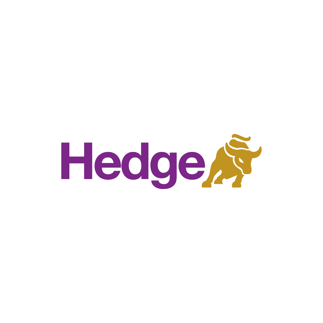
A brand refresh for Hedge Equities combining logo redesign with TV-commercial art direction. The new identity replaced a generic bull silhouette with a purpose-built geometric mark, which the client adopted across the brand and its published television commercials.
Overview
A financial brand refresh extended into commercial storytelling, designed to make the identity feel sharper, more visible, and easier to remember.
A financial brand refresh extended into commercial storytelling, designed to make the identity feel sharper, more visible, and easier to remember.
A financial brand refresh extended into commercial storytelling, designed to make the identity feel sharper, more visible, and easier to remember.
Industry - Financial Services / Wealth Management
Industry - Financial Services / Wealth Management
Client – Hedge Equities
Client – Hedge Equities
Role - Logo Redesign, Brand Design, and Art Direction
Role - Logo Redesign, Brand Design, and Art Direction
Contribution – Designed the logo refresh and developed the visual art direction for the TV commercials; film direction and cinematography were handled by the production team
Contribution – Designed the logo refresh and developed the visual art direction for the TV commercials; film direction and cinematography were handled by the production team
Scope - Identity Refresh, Logo Redesign, Brand Application, and TVC Art Direction
Scope - Identity Refresh, Logo Redesign, Brand Application, and TVC Art Direction
Context – Commissioned project completed with Spread Factory
Context – Commissioned project completed with Spread Factory
Status – Approved and launched; the redesigned identity was adopted by the brand and featured in the published TV commercials
Status – Approved and launched; the redesigned identity was adopted by the brand and featured in the published TV commercials
Timeline - 2024
Timeline - 2024
The Challenge
From a Generic Bull Silhouette to a Purpose-Built Mark
From a Generic Bull Silhouette to a Purpose-Built Mark
From a Generic Bull Silhouette to a Purpose-Built Mark
The previous logo used a stock-vector-style bull silhouette without a clear underlying idea or geometric structure. The redesign brief was to reinterpret the bull associated with the stock market as a cleaner, more distinctive symbol—one that could feel credible, contemporary and recognisable across both brand communication and screen-based use.
The previous logo used a stock-vector-style bull silhouette without a clear underlying idea or geometric structure. The redesign brief was to reinterpret the bull associated with the stock market as a cleaner, more distinctive symbol—one that could feel credible, contemporary and recognisable across both brand communication and screen-based use.
The previous logo used a stock-vector-style bull silhouette without a clear underlying idea or geometric structure. The redesign brief was to reinterpret the bull associated with the stock market as a cleaner, more distinctive symbol—one that could feel credible, contemporary and recognisable across both brand communication and screen-based use.
Design Logic
From Sculpture to Geometric Symbol
From Sculpture to Geometric Symbol
From Sculpture to Geometric Symbol
Following the client’s direction, the mark draws on New York’s Charging Bull and its associations with market strength and forward motion. Rather than reproduce its sculptural detail, I reduced the bull to its most recognisable cues—its lowered head, horns, muscular stance and sense of charge—and rebuilt them through a system of circles. The construction creates consistent curves and a compact silhouette that remains clear across print, screen and motion.
Following the client’s direction, the mark draws on New York’s Charging Bull and its associations with market strength and forward motion. Rather than reproduce its sculptural detail, I reduced the bull to its most recognisable cues—its lowered head, horns, muscular stance and sense of charge—and rebuilt them through a system of circles. The construction creates consistent curves and a compact silhouette that remains clear across print, screen and motion.
Following the client’s direction, the mark draws on New York’s Charging Bull and its associations with market strength and forward motion. Rather than reproduce its sculptural detail, I reduced the bull to its most recognisable cues—its lowered head, horns, muscular stance and sense of charge—and rebuilt them through a system of circles. The construction creates consistent curves and a compact silhouette that remains clear across print, screen and motion.




On Screen
The Identity in Published TV Commercials
The Identity in Published TV Commercials
The refreshed identity was carried into the published TV commercials shown below. I developed the visual art direction and translated the new logo and brand language for the screen, while film direction and cinematography were handled by the production team.
The refreshed identity was carried into the published TV commercials shown below. I developed the visual art direction and translated the new logo and brand language for the screen, while film direction and cinematography were handled by the production team.
The refreshed identity was carried into the published TV commercials shown below. I developed the visual art direction and translated the new logo and brand language for the screen, while film direction and cinematography were handled by the production team.