Movo
Overview
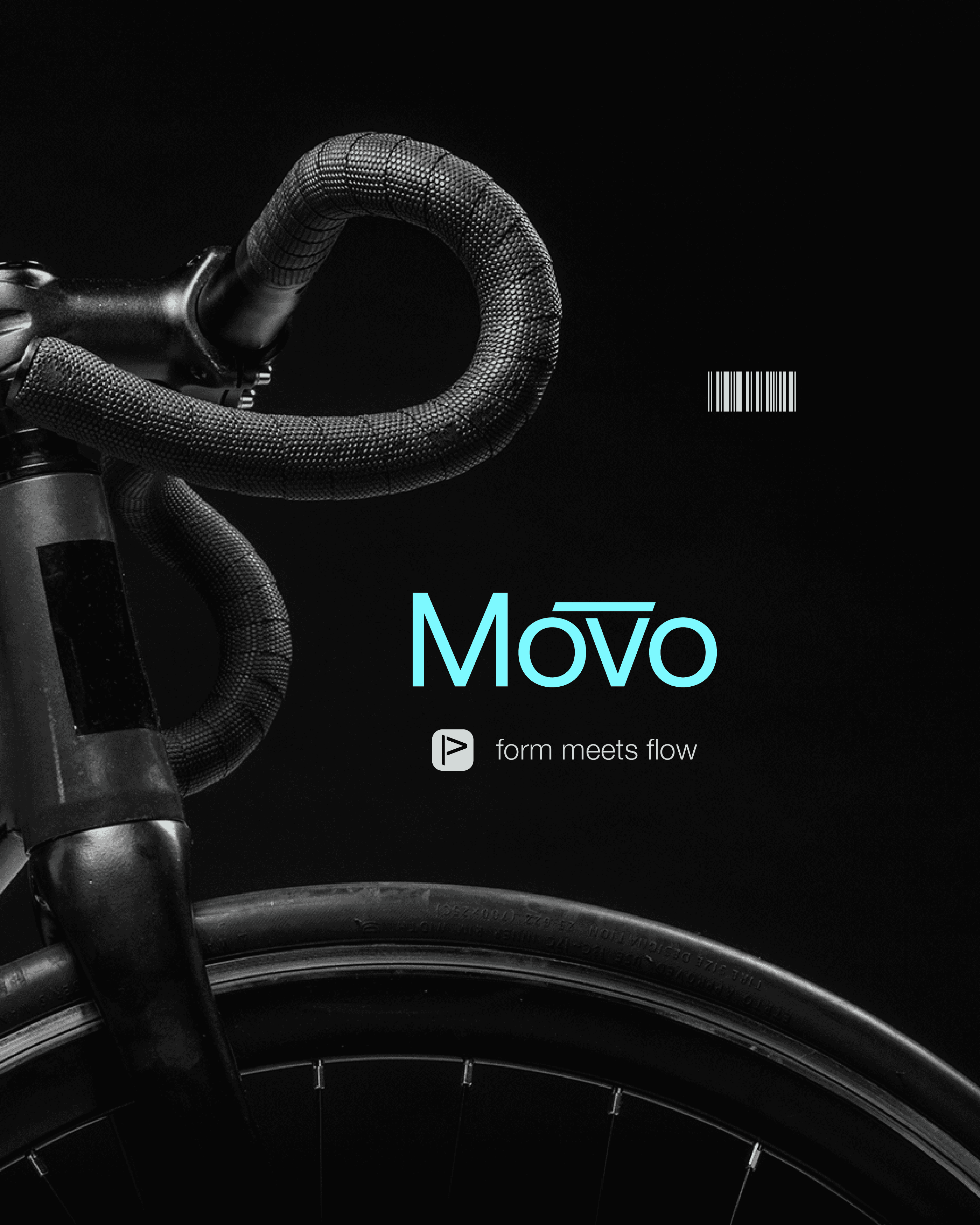
Movo was imagined as a premium bicycle brand designed from the ground up. The challenge was to create an identity that felt engineered yet expressive, rooted in performance without falling into the aggressive visual language often seen in the category. It needed to feel precise, fluid, and distinct across both brand and campaign touchpoints.
Mobility


Built from the Ground Up
Movo was imagined as a premium bicycle brand designed from the ground up. The challenge was to create an identity that felt engineered yet expressive, rooted in performance without falling into the aggressive visual language often seen in the category. It needed to feel precise, fluid, and distinct across both brand and campaign touchpoints.
Challenge 1:
Challenge 2:
Challenge 1:
Motion as Identity
Motion became the logic behind the brand, not just a message applied to it.
The identity was shaped around the idea that movement is not just something the product delivers, but something the brand itself should embody. Rather than relying on speed clichés or technical excess, the visual language draws from flow, control, and form. The result is a brand that feels dynamic in a quiet, confident way.
Naming & Positioning
The name Movo is short, memorable, and naturally linked to motion. It creates an immediate sense of movement while remaining clean and premium. From the beginning, the positioning was built around forward flow rather than force, giving the brand a more refined and contemporary character.


Visual Identity
The visual system balances sharpness with fluidity. Clean typography, restrained composition, and flowing graphic elements work together to express control, rhythm, and movement. The identity avoids overloading the viewer, instead creating a premium presence through clarity and tension between structure and motion.
Tone of Voice
The verbal layer was developed to match the brand’s visual restraint. Messaging stays direct, minimal, and assured, allowing the idea of movement to come through with clarity. Lines such as Form Meets Flow and Some lines are drawn. Others are ridden. extend the identity into campaign language without losing precision.
Applications
The system was designed to move smoothly across brand and campaign touchpoints, from hero visuals and posters to digital expression. Each application carries the same balance of precision and motion, helping the brand feel consistent, recognisable, and built for real-world extension.
The Outcome
Movo became a brand that feels engineered yet fluid, premium yet approachable. By grounding the identity in motion rather than decoration, the project created a visual and verbal system that feels coherent, distinctive, and ready to grow across multiple touchpoints.
Outcome 1:
Outcome 2:
Outcome 3:

Grid
List
Feed
Full


Grid
List
Feed